How to Incorporate Dark Mode in Your Mobile App Design
30 May 2025
Dark mode has taken the digital world by storm. From social media apps to system-wide settings, users now expect an easy toggle between light and dark themes. But incorporating dark mode into your mobile app design isn’t just about flipping colors—there’s an art to it.
If you want to give your users this sleek, eye-friendly feature, you need to approach it strategically. In this guide, we’ll dive deep into how you can seamlessly integrate dark mode into your mobile app design while keeping usability, aesthetics, and accessibility in mind.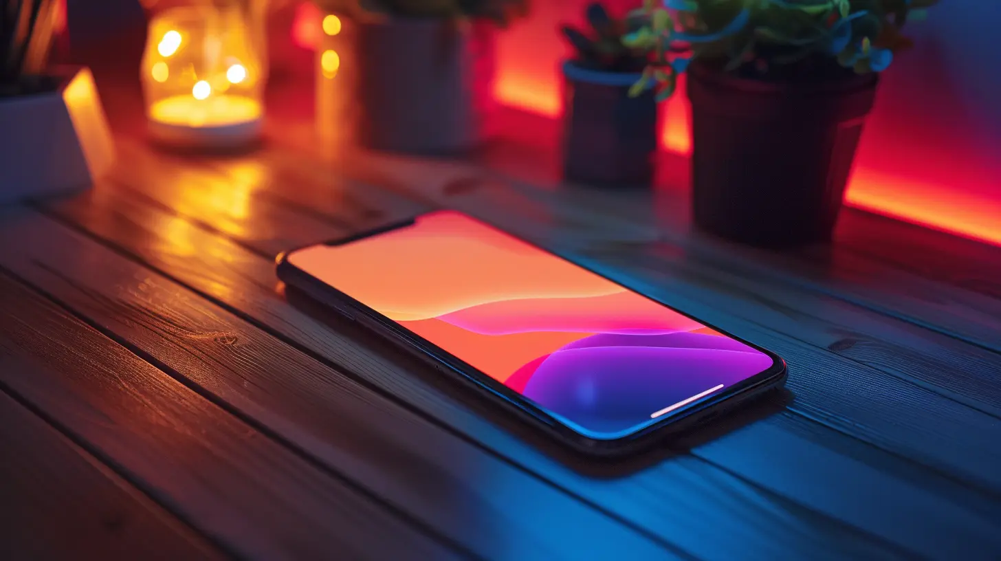
🎨 Why Dark Mode Matters
Dark mode isn’t just a trendy feature; it has real benefits that make it a staple in modern UI/UX design.✅ Reduces Eye Strain – Dark mode is easier on the eyes, especially in low-light environments.
✅ Saves Battery Life – On OLED and AMOLED screens, dark mode can extend battery life by consuming less power.
✅ Enhances Visual Appeal – A well-designed dark mode adds a touch of sophistication and modernity.
✅ Improves Accessibility – Some users find dark mode more comfortable, especially those with light sensitivity.
That said, designing dark mode isn’t as simple as inverting colors. Let’s get into how to properly implement it.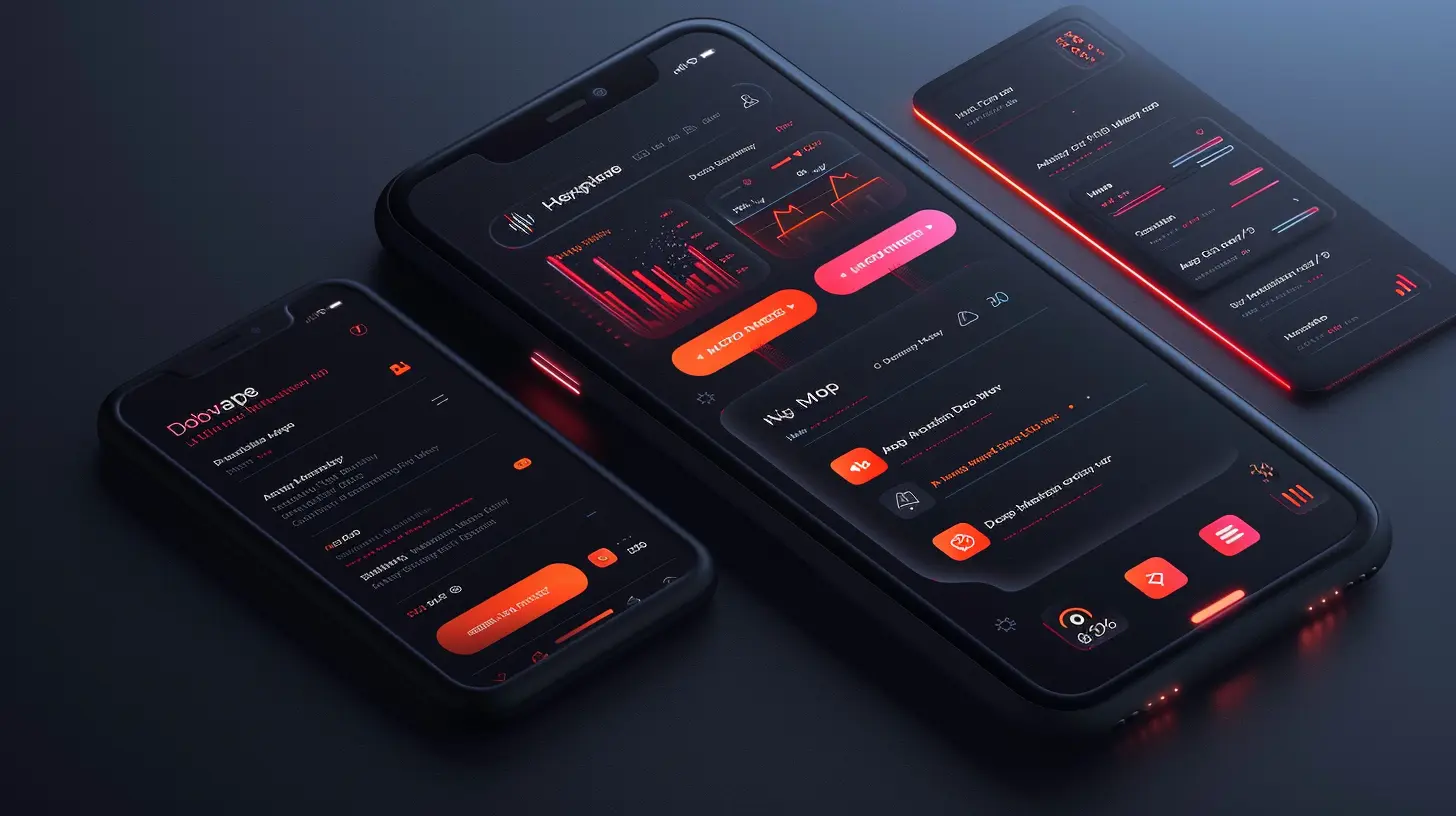
🛠 Steps to Incorporate Dark Mode in Your App
1. Understand User Preferences
Before making dark mode your default theme, consider giving users control over their experience. Provide an option to toggle between light and dark mode manually or follow the system theme settings.Most modern operating systems (iOS, Android) allow apps to detect the user’s preferred theme and adapt accordingly. This ensures a seamless experience rather than forcing a one-size-fits-all approach.
2. Choose the Right Shades
One of the biggest mistakes in dark mode design is using pure black (#000000). While true black might sound like the ultimate dark theme, it actually creates too much contrast, which can cause strain.Instead, go for dark gray tones (#121212, #1C1C1E). These provide a softer contrast for text while maintaining the dark mode aesthetic.
📌 Tip: Use material design principles when selecting colors. Google’s Material Design Dark Theme and Apple’s Human Interface Guidelines offer great recommendations.
3. Optimize Text Colors
Readability takes a hit if your text blends into the background. To keep everything legible:- Use off-white or light gray colors for text instead of pure white.
- Ensure high contrast without straining the eyes.
- Consider different levels of brightness for primary, secondary, and tertiary text.
A good rule of thumb: Use a contrast ratio of at least 4.5:1 for body text to maintain accessibility.
4. Modify Images and Illustrations
Not all images look good in dark mode. White backgrounds in images can look harsh and out of place.🔹 Solution? Use transparent PNGs or SVGs with adaptable colors. If your app heavily relies on images, consider applying a dark overlay to help maintain consistency.
5. Handle Icons and UI Elements
Your UI components—buttons, cards, inputs—need to be visibly distinct in dark mode.- Avoid highly saturated colors as they might look too intense on dark backgrounds.
- Use elevated shadows and subtle gradients to create depth.
- Ensure active buttons stand out while inactive ones are slightly dimmed.
6. Adjust Shadows and Elevations
Shadows behave differently in dark mode. A shadow designed for light mode might look out of place when flipped into dark mode.✔ Instead of dark shadows, use soft highlights or light borders to create the illusion of depth.
7. Focus on Accessibility
Accessibility should never take a backseat. Some users rely on high contrast modes or screen readers, so your dark mode should be WCAG-compliant.✔ Use accessibility testing tools to ensure readability.
✔ Give users an option to turn off dark mode if needed.
✔ Avoid pure blue colors—blue light can still cause strain, making reading difficult at night.
8. Let Users Customize Their Experience
Want to take things up a notch? Allow users to tweak their dark mode preferences! Some users might prefer a pitch-black theme, while others might want a soft gray alternative. Offering a few preset options can make your app even more user-friendly.9. Test, Test, and Test Again
Before rolling out dark mode to all users, test it rigorously.✔ Check for contrast issues.
✔ Test on different devices and screen sizes.
✔ Get real user feedback before the final release.
🚀 Implementation: How to Code Dark Mode
If you’re developing a dark mode feature from scratch, here’s how you can implement it on two popular platforms:Dark Mode in iOS (Swift)
iOS provides built-in dark mode support. To adjust your app automatically:swift
overrideUserInterfaceStyle = .dark
You can use dynamic colors in your assets:
swift
let textColor = UIColor { (traitCollection: UITraitCollection) -> UIColor in
    return traitCollection.userInterfaceStyle == .dark ? UIColor.white : UIColor.black
}
Dark Mode in Android (Kotlin)
For Android, enable night mode in your app’s `styles.xml`:xml
To toggle dark mode programmatically:
kotlin
AppCompatDelegate.setDefaultNightMode(AppCompatDelegate.MODE_NIGHT_YES)
By applying system-recognized dark mode settings, you ensure your app integrates smoothly with the user's preferences.
🔥 Common Pitfalls to Avoid
Even though dark mode is a fantastic feature, many developers make avoidable mistakes. Here’s what NOT to do:❌ Using Pure Black – This creates extreme contrast, making it difficult to read.
❌ Neglecting Contrast Ratios – Low-contrast text can be hard to read, especially for visually impaired users.
❌ Forgetting UI Consistency – Ensure all UI elements transition smoothly between light and dark mode.
❌ Overlooking Image Adjustments – Bright images can stick out awkwardly in an otherwise dark UI.
If you avoid these pitfalls, your dark mode implementation will feel polished and seamless.
🌑 Wrapping Up
Incorporating dark mode into your mobile app isn’t just about aesthetics—it’s about improving user experience, accessibility, and functionality. When done right, dark mode feels natural and intuitive rather than just an afterthought.By following best practices—choosing the right colors, optimizing text, tweaking UI elements, and prioritizing accessibility—you’ll create a smooth and delightful dark mode experience for your users.
So, are you ready to turn down the lights and give your users the dark mode they’ve been waiting for?
all images in this post were generated using AI tools
Category:
App DevelopmentAuthor:

Kira Sanders
Discussion
rate this article
3 comments
Fiona Love
Ah yes, because our eyes definitely needed more excuses to avoid sunlight. Dark mode: saving eyes and ruining battery life!
June 3, 2025 at 10:28 AM
Kira Sanders
Thanks for your feedback! Dark mode can help reduce eye strain in low-light environments, but we understand the trade-offs with battery life. It’s all about finding the right balance for users!
Holly Cole
This article offers valuable insights into integrating dark mode into mobile app design. I appreciate the emphasis on user experience and accessibility. Personally, I find dark mode visually appealing, but I also recognize the importance of ensuring readability and comfort for all users. Great read!
June 2, 2025 at 3:53 AM
Kira Sanders
Thank you for your thoughtful feedback! I'm glad you found the insights valuable and appreciate your emphasis on readability and user comfort in dark mode design.
Sadie Carter
Love the idea of dark mode! It not only enhances aesthetics but also boosts user comfort. Can’t wait to try it out! 🌙✨
May 30, 2025 at 10:33 AM
Kira Sanders
Thank you! We're excited that you appreciate dark mode—it's a game-changer for both style and comfort. Enjoy implementing it! 🌙✨